Final Major Project Album Covers


Proposal
I am going to be making a bunch of album covers using the
same person to show that I can use the same person but adept it to different
topics and designs. The reason I have chosen this is because album covers can use
a range of designs and styles from surreal, realistic and mysterious and I like
how broad the choices are and not fixed to one style like in the previous
assignments.
I will be creating my work on Photoshop but once I have took
the images I wanted of the actor with the camera I am able to hire out from
college. I can then put it onto Photoshop and begin to create a unique album
cover with one of the styles I have chosen from my PowerPoint research.
I want my work to
look unique and in some cases depending on my designs I will have them
colourful and really stand out and my own inspiration but collaborated with a
bunch of other inspirations.
I would want my covers to be like this bold and colourful it will be hard becasue i am using real photos but im sure i will be able to manage and i could create them by editing the levels and curves to create and colourful look as a shortcut and then use the hue/saturation tool to edit the colours.
I will be looking at other album covers that are currently
selling inside shops near me and also even a few posters that are design and
graphics related so I have a broad amount of research and not just sticking to
one subject because graphics can be a whole lot more.
The audience I will focus on and a easy way to get this info
on audience is for me to create a survey on survey monkey and get feedback off
others in my class and around wherever.
I will also go to my library and look at a bunch of books
and the design layout of them for inspiration
I will present my piece with musical notes that I can cut
out and have them dangling around my pieces because after all it’s a musical
them and my designs will be presented in album layout so the square looking design
that is the most common of all even on CD cases its square.
Student Name:
Chosen Theme:
Title of Work:
|
||
Week / Date
|
In Class Activity
|
Independent Study
|
W/C April
18th 2016
|
||
W/C April
25th 2016
|
·
Proposal Review with Tutor
taking shots of the actor and adding additional research ALOT of research
and adding test shots and talking about my images
|
Friday
the 29th is a Interview day and students are not in.
|
W/C May
2nd 2016
|
|
Monday
the 2nd of May is a Bank holiday.
|
W/C May
9th
2016
|
|
|
W/C May
16st 2016
|
|
|
W/C May
23th 2016
|
Work
Experience Week
All
students will be working on this all week!
|
Tuesday
the 24th of May is an Interview day and students are not in.
|
Half Term
|
||
W/C June
6th 2016
|
|
|
W/C June
15th 2016
|
|
Deadline:
Group A: Thursday 16th June 2015
Group B: Thursday 16th June 2015.
|
Artists

i like the uniqueness of this and how good it was how it creates a name doing this while keeping the bike image
Juri Zaech
http://www.juri-zaech.com/wordpress/?page_id=25
I’m a Swiss Art Director, currently living in Paris, France. While I work in advertising I like to do little side projects. This is what you’re looking at. Thanks for visiting.
Juri Zaech
Typography and Art Direction – Paris, France
Typography and Art Direction – Paris, France
i like the uniqueness of this and how good it was how it creates a name doing this while keeping the bike image
http://www.juri-zaech.com/wordpress/?p=16
http://www.juri-zaech.com/wordpress/?p=269


i like the pop arty look to this it gives a old school look and that the band is possible older generation
http://www.juri-zaech.com/wordpress/?p=269
Minga Firm
For all of these i used the settings of:
ISO: 372
APERTURE: 2.0
EXPOSURE TIME 1/50
FOCAL LENGTH: 2.872 MM

i wanted Nathan to do a pose in which i would then use in a album cover
ISO

ISO 372
APETURE 2.0
EXPOSURE TIME 1/50

ISO 269
APETURE 2.0
EXPOSURE TIME 1/50

ISO 294
APERTURE 2.0
EXPOSURE TIME 1/50


ISO 294
APERTURE 2.0
EXPOSURE TIME 1/50

ISO 406
APERTURE 2.0
EXPOSURE TIME 1/50

ISO 219
APETURE 2.0
EXPOSURE TIME 1/50

ISO 230
APERTURE 2.0
EXPOSURE TIME 1/50

ISO 219
APETURE 2.0
EXPOSURE TIME 1/50

ISO 212
APETURE 2.0
EXPOSURE TIME 1/50

ISO 219
APERTURE 2.0
EXPOSURE TIME 1/50
i like the pop arty look to this it gives a old school look and that the band is possible older generation
https://www.behance.net/gallery/315883/The-Music-Series001
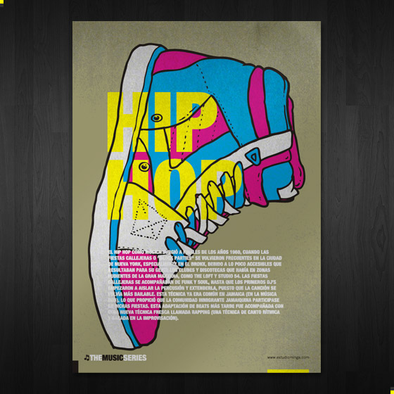
i like the trainer and the relevant colours like the last one where the image seems to be the center of attention which also has text there so your attentionj is grabbed at the text


Creating my piece
Dimensions of my album cover is going to be 31.43cm both length and width creating the original record album cover template


i like the trainer and the relevant colours like the last one where the image seems to be the center of attention which also has text there so your attentionj is grabbed at the text
Maria Grønlund
https://www.behance.net/mariagroenlund

i like the look of this and the vibrant and bold colours and creating a liquid like art work which looks moving

i like how the spikes colour varies as it flows over the hedgehogs base and creates a vibrant piece
Rus Khassanov

i like how the colours are blending and mixing like washing up liquid like and also looks like there are small mountains inside with the V shapes which looks like a mountain range

i like how this has a splash like oil effect on it and has the basic features of the face still identifiable so i like this feature but also having the background and even an overlay of a splash and keeping the hoodie its original state
Nicole Martinez
http://arterdesignist.com/portfolio/portraits-of-women/
i like how i just outlines the figure and the few curves which make up the hair with not a lot of detail but also making it obvious what it is very simply tho
once again with very few detail but outlining the main features to create the image in its simplest form
Books that i looked at

i like how the flowers show a whole range of colours and really grab your attention because thats what colours do when they are that bright and vibrant and i think this albums music will be very calm and very anti- agressive and swearing is none.


i liked this one because its creative and also reminds me of a kids doodle book with lots of random drawings and colours which a kid would use so i think this gives the album a broad and open selection of music maybe because of the random drawings

i like the simpleness of this cover because it has a bright background and to grab attention to something now all you would have to do it use a darker and more bold colour to make whatever stand out and in this case its the nuclear logo which stands out and the bold black text which is also simply spaced out and in block capitals.

i like this because of the unique and randomness but also the demon like eyes that are lit up. it also has a vintage feel because of the style of the wallpaper.
Creating my piece
Dimensions of my album cover is going to be 31.43cm both length and width creating the original record album cover template

i started of with a layout of 31.43cm which is the usual


to create this i used my models face for a close up and then changed the image to black and white under the image bar on Photoshop
Then for the wavy lines i used the wavy line in the custom shape selection you have when going through the different shapes.
Also if you use the paint bucket tool you are then able to change the colour of these shapes individually.


The music notes was also from the custom shapes area in which all i had to do is rotate and enlarge the chosen design.

to create this all i did was erase the background using the eraser tool and then after that i put a blank layer for the background and changed it into this square illusion using the blending options available to create it with the pattern tool.
then to make the model into the green and pink colour i used the hue/saturation tool under image in Photoshop and then used the sliders to create this effect and colour.
to create the box all i did was overlay the rounded square shape in Photoshop and change the colors to my preference.


HOW DID I CREATE THIS?

i made this by using a circle but not fixing its areas so instead i was able to make an egg looking shape which i used as the head and then i used the lightning bolts as the cracks in the egghead shape. I then erased around the lightning bolts to create the hollow look to bring the background through. then i used a range of blending tools to create the effect
firstly i used blending tools

i wanted to go with my research so i decided to make 6 album covers so i can try and hit every style that was suggested in my survey to im going to create all styles on my survey but different types of shots for the main cover

people choose quite a balanced between photographic and a mix of both so i have decided i am going to make no graphic ones but going to take and image and edit the filter of it on Photoshop creating a graphic look but keeping the image that i took on my camera the same form and shape but lets realistic.